role
founder, project manager & art direction
stage
alpha build, in development
scope
design document, production, art direction, concept pipeline
a reaction arcade i founded, designed and art-directed
project lw — working title last warrior — is a mobile reaction arcade: four sectors, telegraphed attacks, a block window that keeps shrinking.
it had no art when the loop first worked, so the style became mine too — the hero characters, the arena concepts, the rules that everything after them had to follow. one project, told from both ends: the document and the drawings.
the game
project lw is a mobile reaction arcade. the hero stands in the centre of an arena with four sectors around him and an enemy waiting in each one. an attack is telegraphed, you tap that sector inside the block window, and the round only ends when you run out of health.
i founded the project, wrote the design document and ran the team — and the art direction stayed with me. what follows is the loop as it stands in the alpha build.
the whole game is one question asked faster and faster: which sector, and can you still get there.
the tempo curve does the rest. spawn intervals shorten, the block window narrows, inverted and combo enemies arrive, and a boss lands every 60–90 seconds — guaranteed, so randomness never assembles an impossible sequence.
platform
ios and android. touch-first: controls sit at the screen edges so thumbs never cover the arena.
audience
12+, short-session players, casual to mid-core.
session
one to five minutes. the endless run is scored by survival time and blocks held, and that score is the leaderboard.
stage
alpha build, in development
heroes, charges, difficulty
heroes are the meta layer. you start with a base hero and buy the rest with soft currency; each one changes how a round is survived rather than how fast it is won.
base hero
no abilities. three to five health and a meter that fills on clean blocks. the tutorial hero, and the honest benchmark for every difficulty change.
defender
circle of shields — the next successful block grants a shield that absorbs three hits. passive: +1 maximum health.
dark knight
death — kills the four surrounding enemies instantly. passive: every third enemy dies to a single block. meter: restores one health.
frost knight
freeze — no enemy spawns in a blocked sector for a set time. passive: a health pool that never refills. meter: slows the attack rhythm.
abilities run on charges. before the round you choose how many to carry — three per ability, six if the hero has two — and they burn whether or not you spend them. charges come back slowly on a timer, from daily challenges, or from a rewarded video.
the interesting decision happens in the preparation menu, not in the round.
difficulty scales on four dials: spawn interval, block window, enemy mix and boss cadence. if a player keeps dying inside the first thirty seconds the window widens a little; if they survive comfortably, it tightens.
finding the style
the prototype was grey boxes and a working block rule. nobody on the team drew, so the look was mine to decide — and a style is only a set of decisions somebody has to make.
the style was found on one character. the finished dark hunter is on the left, in motion; on the right are the four directions we tried before settling — a cold monochrome pass, chibi proportions, and two siblings drawn to the same rules: the veiled lancer and the watcher.
dark hunter
the dark hunter was the first character to settle the look: a hooded figure with nothing but shadow for a face, eyes and twin blades in the same vivid violet, a worn purple cloak, and a night sky of constellations and d&d symbols behind him.
prompt
Dark hunter, face hidden beneath a hood with only a shadow visible, eyes glowing bright violet, a blade in each hand with edges shining the same vivid violet, torso draped in a worn, tattered purple cloak, Dungeons & Dragons character concept art, blue glowing stars constellations and d&d geek symbols, black background
parameters
three directions for one hero
one character settles a look; a roster needs range. before anything went to a 3d artist i ran three deliberately different directions, giving up randomness as each pass moved closer to production. concept work earns its keep by removing uncertainty before modeling starts — it is not there to produce final illustrations.
one — silhouette first
so each pass had to leave a modeler less to guess at: silhouette, proportions, materials, costume logic and visual direction, decided before anyone commits time to geometry.[1]
i used generative ai as a rapid visual exploration tool, moving through three deliberately different art directions and increasing the level of control with each pass.
the first direction was intentionally rough. the character was a veiled lancer: narrow proportions, a hooded face, a long double-bladed weapon and an angular silhouette. at this stage i deliberately avoided solving every costume detail. the important questions were much larger:
does the character read immediately? does the weapon feel like part of the identity? does the silhouette communicate danger before we see the face?
the prompt therefore concentrated on large-form decisions:
01
anthropomorphic proportions
02
sharp, angular shapes
03
dominant weapon silhouette
04
obscured face
05
high contrast
06
restrained detail
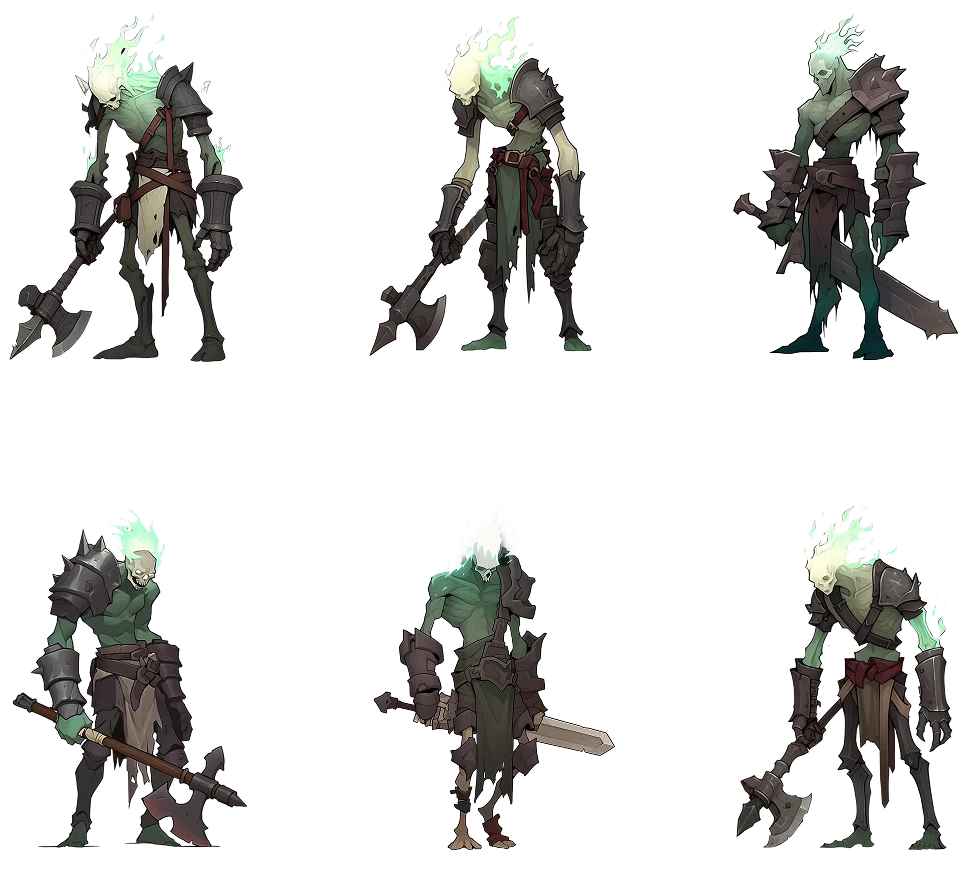
silhouette
01
silhouette
02
the result was useful precisely because it was not over-resolved. the branch established an archetype and shape language quickly enough to decide whether the direction deserved further development.
this mirrors a common character-production principle: recognizable silhouettes and large forms should survive before detail is allowed to take over.[2]
two — how far the style can move
the second exploration went in almost the opposite direction. instead of a restrained physical threat, i explored an eccentric arcane character built around:
01
aged materials
02
an expressive pose
03
glowing magical accents
04
small narrative props
05
constellation-like effects
06
strong separation from a dark background
the interesting problem here was visual hierarchy. glowing effects are extremely easy to overuse. once everything glows, nothing actually feels magical anymore.
so the effects were treated as accents rather than decoration. the face and major silhouette still had to read first; light trails, symbols and smaller effects were there to support the character's story.
this phase also introduced multiple style references rather than relying entirely on text. that made the process less about finding increasingly imaginative adjectives and more about building a reference-guided visual constraint system.
silhouette
03
silhouette
04
three — something a 3d artist can read
the final branch had a different objective: less illustration-first, more production-aware.
i explored a female knight with a more grounded fantasy treatment and a much more explicit design specification. instead of describing only a mood, the generation was broken into separate layers:
character
full-body female knight
identity
asymmetrical platinum hair, braided strand, facial scar
pose
confident, dominant stance
camera
low-angle full-body composition
costume
plate armor, cloth layer, leather straps and belts
materials
worn metal, fabric and leather kept visually distinct
mood
serious dark fantasy rather than exaggerated cartoon stylization
this was also the stage where i combined style references and character references. the reference image was no longer simply inspiration. it became part of the control mechanism.
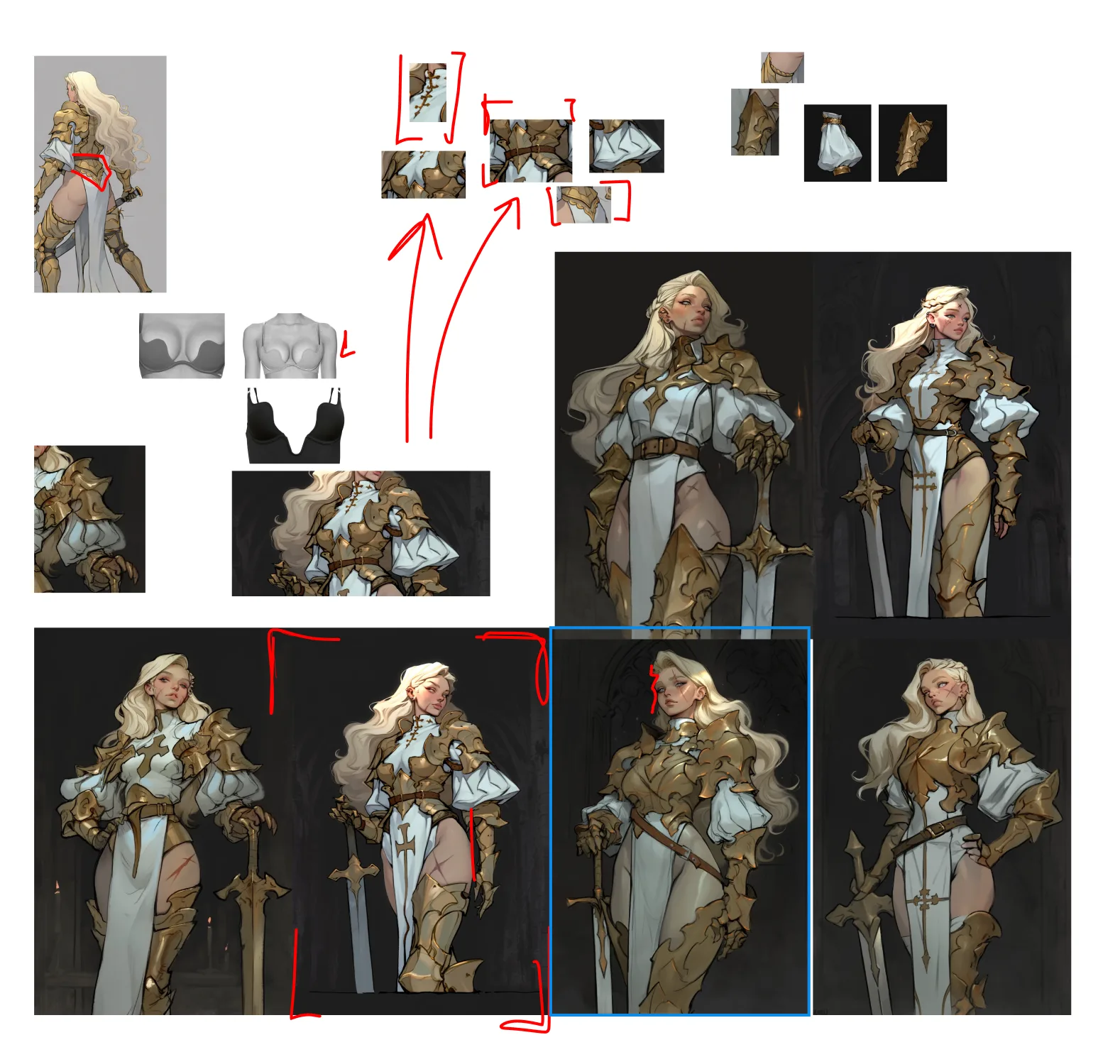
knight branch
exploration vs control
one of the useful lessons from the project was that the right amount of randomness changes during the process.
early exploration benefits from variation. if the system is locked too tightly, it only produces increasingly polished versions of the first idea. later refinement has the opposite requirement: once a promising character appears, excessive variation starts destroying the decisions that were already made.
i therefore treated generation settings as part of the design process:
more freedom while searching. more constraints while refining.
for the later character branch, controlled variation was combined with style and character references so that the model could still offer alternatives without repeatedly reinventing the entire design.
arenas and the handoff
every arena in the hub started as a pile of my concept sheets — drawings, colour call-outs, notes on what must survive production. in the centre is what the artist built from them; around it, the six concepts it grew out of.
concept 01
concept 02
concept 03
concept 04
meadow arena — final result
art byAnna Petrova
concept 05
concept 06
from a pretty image to a model brief
this project also clarified the difference between concept art and key art.
a beautiful three-quarter illustration can communicate mood extremely well while still leaving a 3d artist guessing about the back of a costume, material separation or how individual pieces connect. traditional game-production workflows solve this with turnarounds, orthographic views and additional construction references.[1][3]
the exploratory images in this project were therefore used primarily to answer the earlier questions:
which archetype? which silhouette? which materials? which visual language? which character details are worth preserving?
once those decisions are stable, the next production step is not “generate an even prettier image.” it is to convert the selected design into cleaner references for modeling.
that is where the concept artist on the team took over. he received the whole exploration set, the selected direction and the final character style sheet, and drew production concept art from it — front, back and side views, separated pieces, weapon and hand studies, variants of the same base.
by the time these sheets were drawn the style was no longer in question, which is why they could spend their effort on construction instead of mood.
what did not work
too much decoration
detail arrived before the major forms were settled. the image got richer while the character got harder to read.
style over design
strong stylistic conditioning made exciting pictures with unbuildable costumes. style is a constraint around the design, not the design.
designing and producing at once
whenever the art needed a day, the schedule gave it one. the calendar now gets blocked before the brush comes out.
what i learned
the project began as a fast way to create character ideas. the more useful lesson was that ai exploration needs different rules at different stages of production.
the strongest workflow became:
explore broadly → identify the visual idea → lock the important decisions → refine only what still needs solving.
generative ai accelerated the search. the actual design work was deciding what deserved to survive the search.
an art director’s job is not to draw the game. it is to make the decisions that let others draw it.
the build is in alpha. i will leave updates here soon.
references
- 1proce, v. & sineni, c. next-generation of character concept art: creating photo-real people who don't exist. gdc, 2006.
- 2bachynski, l. bringing orphea to heroes of the storm. gdc, 2019.
- 3game character production from a 2d concept. 80 level — character-production breakdown discussing silhouette and early 3d blockout.